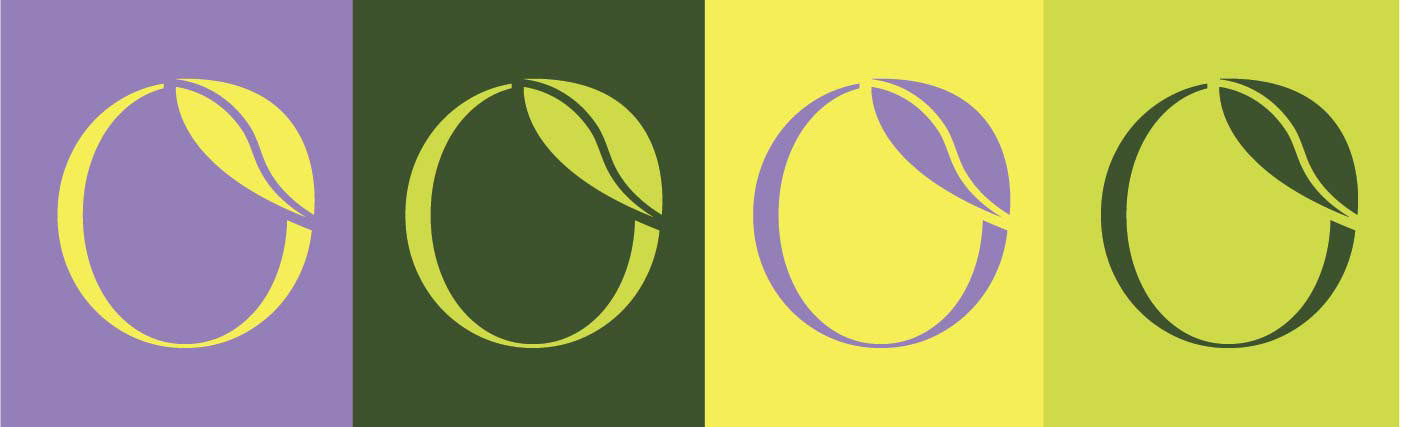
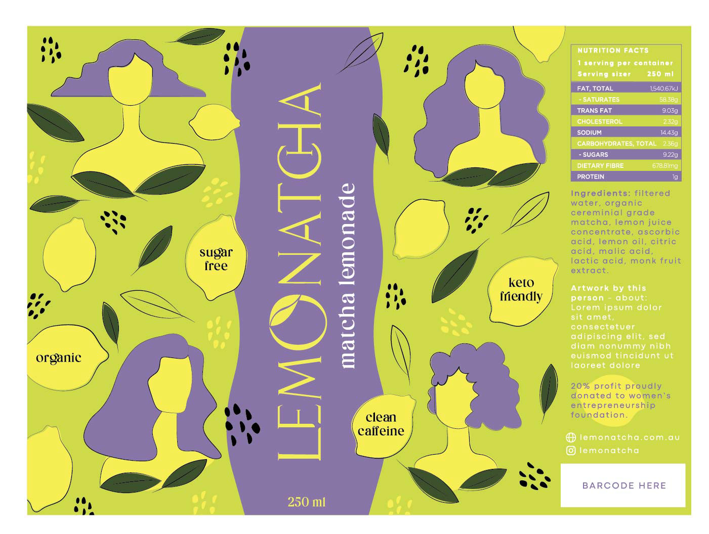
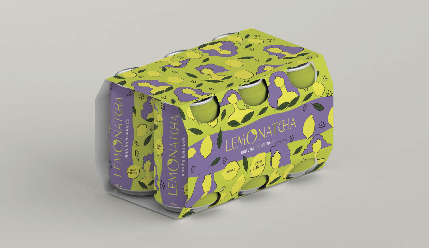
The brand design has been based on the inspiration source elements, showcasing a fresh, creative and modern logo. Using a customized font that is both modern and stylish for a brand that speaks to young women; the letter "O" with a leaf on it, depicting a lemon with a matcha leaf in a subtle and clean look. Some letters joining together to represent the delicious combination of matcha and lemonade.
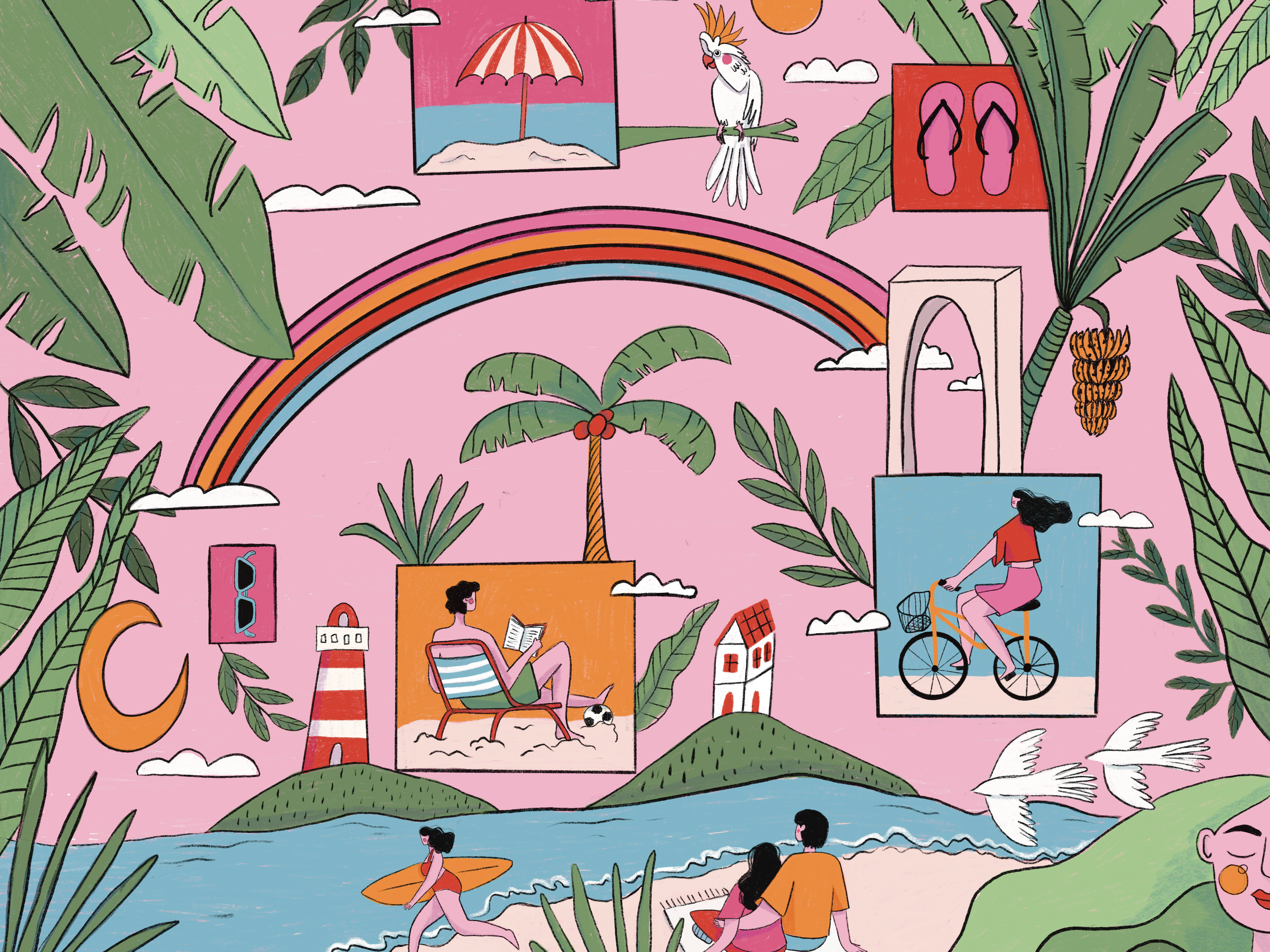
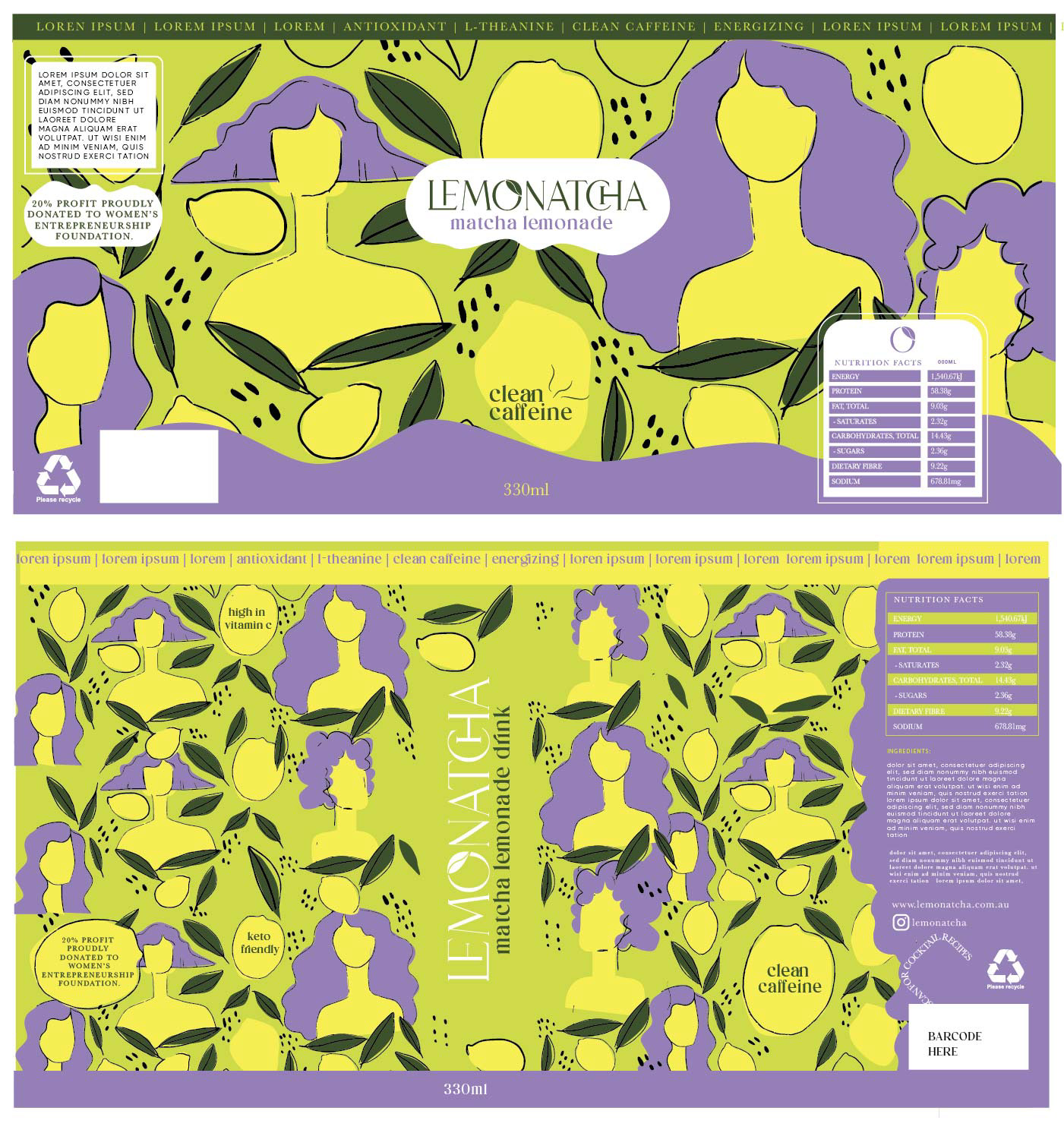
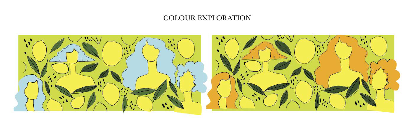
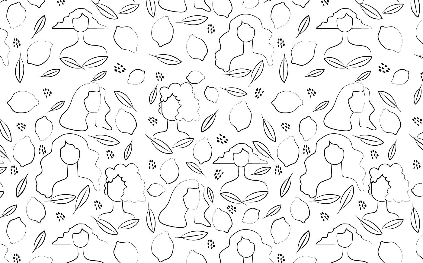
For this concept, the label illustration combines lemons, matcha leaves, and women figures. Design is bold and fun with a trendy look for "instagramable" content as requested by the client. As the target audience is young women aged 20 to 30, the concept shows female figures that can resonate with the audience. As a tiled pattern, it can be easily applied to promotional products, like tote bags, cooler bags; etc.
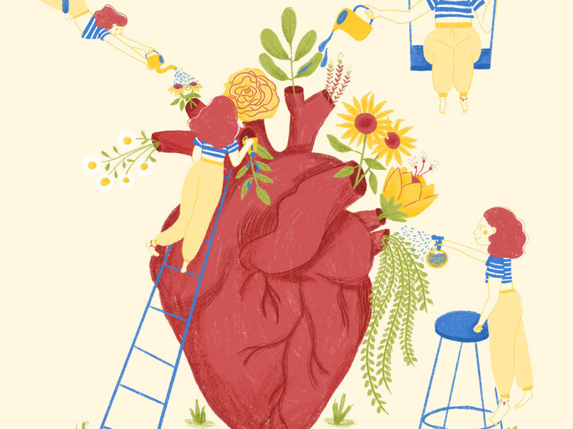
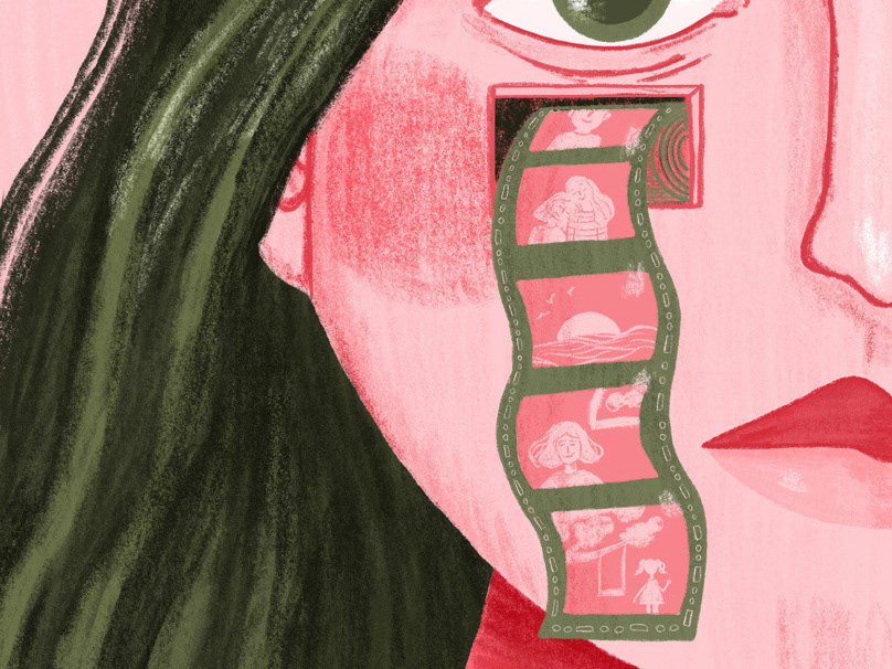
First 2 drafts for the label concept.
__________________________
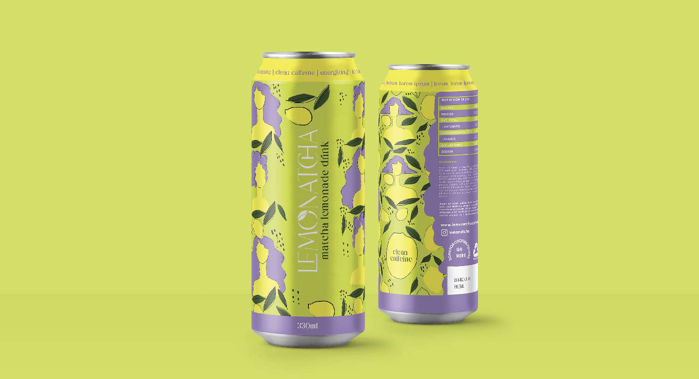
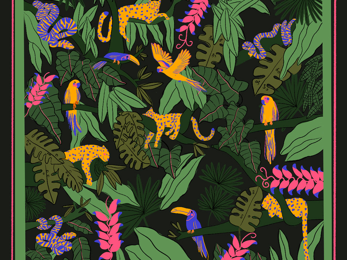
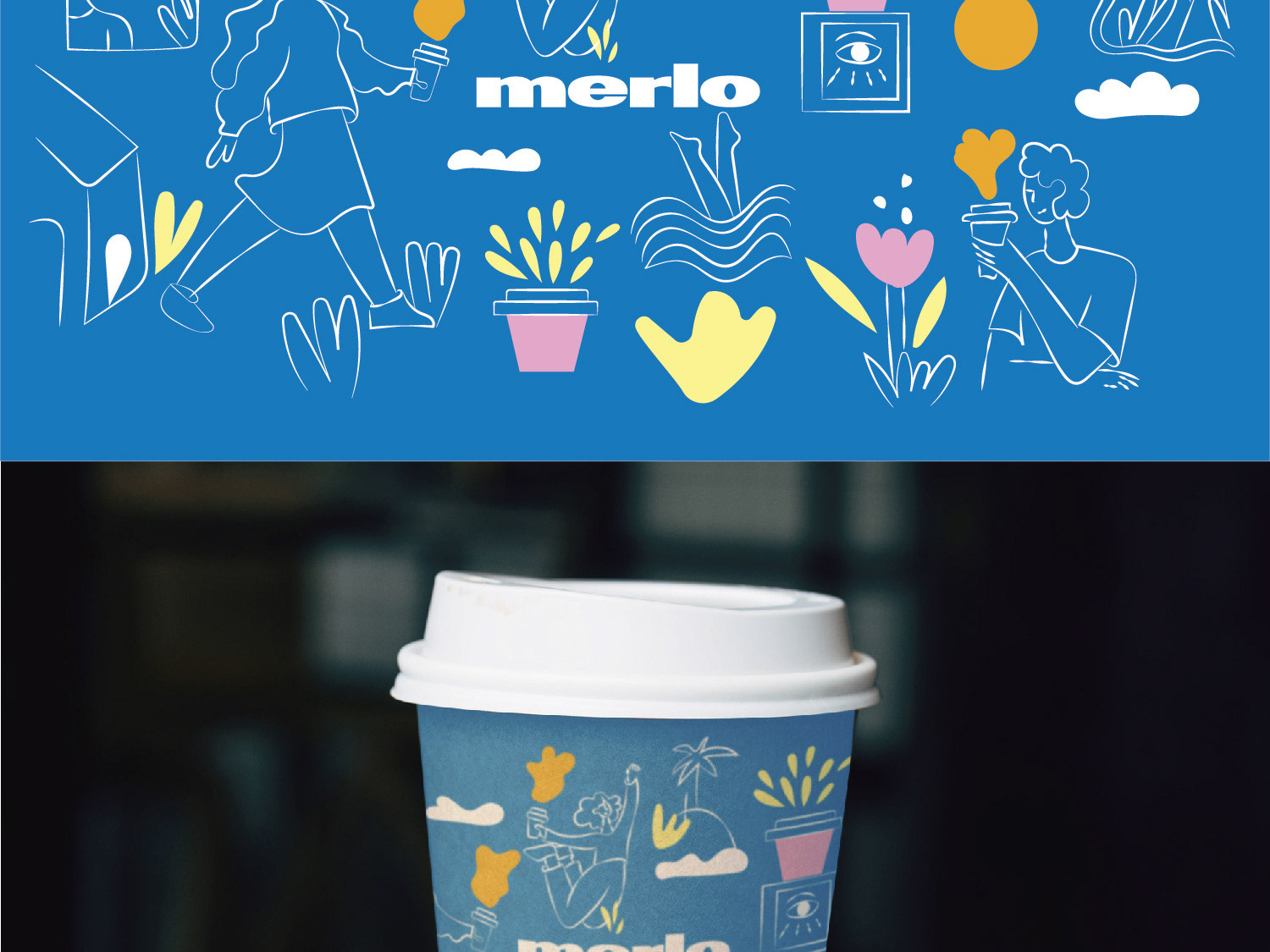
Pattern created to be used across all promotional products and campaigns.
_______________________________________________________________
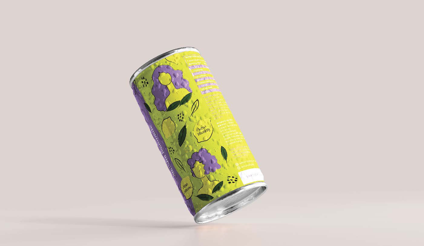
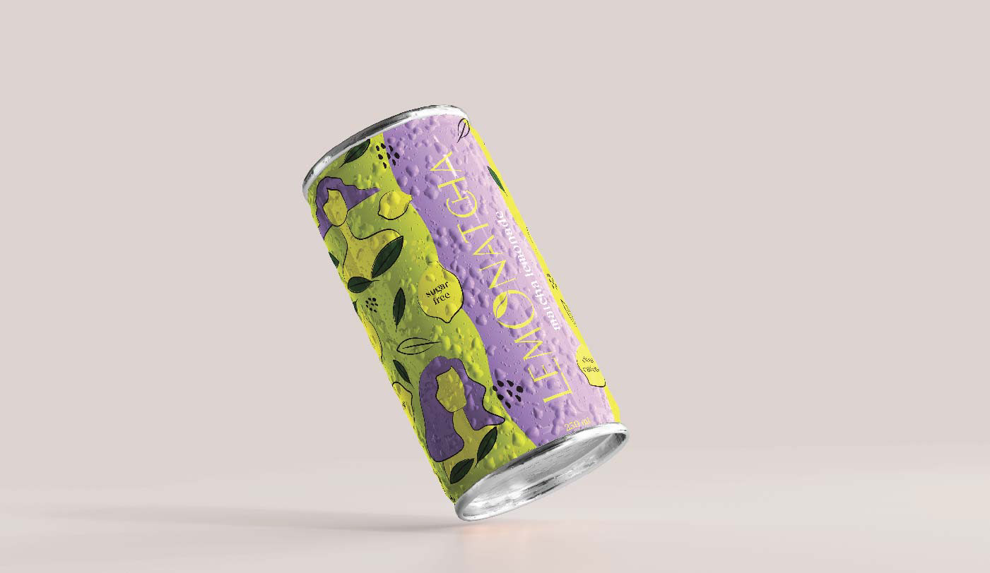
Final label design.
_________________

Studio: Gold Coast Graphic Design
Design and Illustrations: Juliane Ferreira
Follow me on Instagram! :)